Update: Like what you see here? Check out the latest offers at the Football Palestine Store
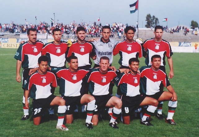
The other day, Subside Sports sent me an email, advertising their deals on jerseys to my surprise they are trying to pass off our 2002/03 Jersey that was made by Training as our 2008/09 jersey. So in order to clear things up I have decided to write a post about our kit history. Also, I would like to issue an appeal to all kit manufacturers everywhere: Please give the PFA a 5 year contract. We’d be happy with the following suppliers: Adidas, Nike, Puma, Lotto, Diadora, Le Coq Sportif, Hummel, Umbro, Uhlsport. We’d also accept: Training, Joma, and anybody else not listed but we’d be less excited about it. Know This: If you give us the opportunity to buy these jerseys we promise you that you will make a profit. But please, do not make us play in red. We play in a nice dark green, with black, red, and white trim.
Early Years 1998/00
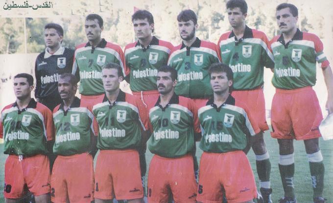
A classic ’90s kit, belonging to a fledgling team. We wore these in the first competitive matches we ever played in 1998 and later on in 1999 during the Pan-Arab Games in Jordan (where Palestine went on to receive the bronze medal. The pattern is established, Green Home White Away with black and red trim on both… intense AND original.
First Qualifying Campaign: 2000/02
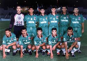
Diadora continues with the same theme, although the home is quite plain (the shade of green is also off), the away is quite nice. Unfortunately, for the first four years of out existence we thought it necessary to put “Palestine” on the jersey just so our opponents could remember who they were playing.
Chilean Style: 2002/03
Sponsor: Training
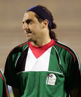
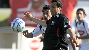
This jersey was secured thanks to our Chilean connections, it is the same design of a CD Palestino Jersey that was produced in the same year but with the PFA logo instead of the Palestino logo. An original, unorthodox design that incorporated the Palestinian flag. This was also the first jersey that featured that horrible, oversized, monstrosity of a logo. At least we don’t have to deal with that anymore. This is the only Palestine Jersey that was widely marketed and available online. Training did not provide the team with away jerseys.
2006 World Cup Qualifying
Away
Sponsor: Le Coq Sportif
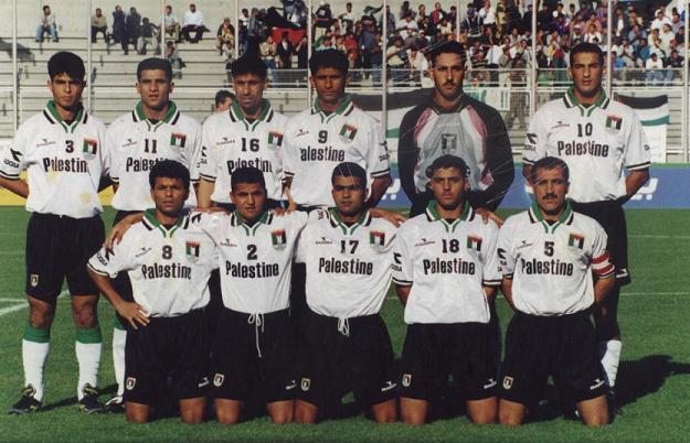
This is by far the best jersey the National team ever wore and it continues with our tradition: Green Home, White Away. Simple, plain, yet elegant… accented with bold black, red, and white. Unfortunately, I have tried and failed to locate this jersey, I’d be ready to put up a king’s ransom for it.
The Flag Jersey (take 2): 2004/07
Home

Away
Sponsor: ?
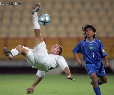
The Home jersey is quite nice, it is an improvement upon Training’s efforts in 2003. This jersey would have been a masterpiece if the flag was horizontal, ala nike’s jerseys for Euro 2008. The red triangle in the flag looks a little bit like a bandana, despite that, this is definitely one of our better jerseys. The away is a monstrosity, a complete lack of imagination and design it doesn’t even deserve a picture to highlight it… instead you can take a look at Ziyad Al-Kord’s bicycle kick versus Uzbekistan.
2007: Palestino loaners
Home:

The Home jersey was only worn twice in the 2007 WAFF Championships, the away jersey was supposed to be worn in the World Cup Qualifier against Singapore, but the shipment was lost. Both good jerseys, but I think Green should always be the home color, this was the start of the deviation.
2008: Rouge? Mais… Puorquoi?
Home:
Away:

Sponsor: ?
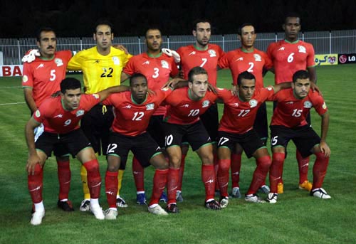
Not ugly Jerseys… but they don’t retain our true character. We don’t wear red… especially not as a home kit. Too many teams do it, heck all our neighbors do it (Jordan, Egypt, Lebanon, Syria). We wear green. GREEN. Our away jersey makes us look like Iran, not the best effort. At least we got a shnazzy new PFA logo with an olive tree and a keffiyeh incorporated into it.
2008: Homecoming
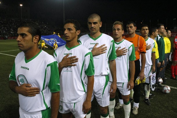
Sponsor: Diadora
This would be the perfect away jersey, for some reason we wore it against Jordan at home. I guess we should be relieved we didn’t wear red, that would have been a true disaster. But I like what Diadora has done here we are sporting white and green without looking like Algeria, Saudi Arabia, Bulgaria, or Ireland. I don’t even mind the large crest.
2009-Present
Home:
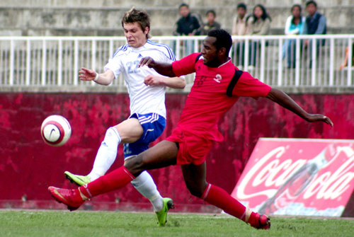
Away:
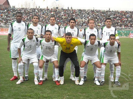
Sponsor: ?
A disappointing follow-up. These jerseys leave a lot to be desired, we should never wear red… never…. EVER. We have never won in red. The two times we did wear it we were torn apart by Iran’s B side and knocked out by Kyrgyzstan. Conversely, our two largest wins vs. Guam and Chinese Taipei came while we were in green. The away jersey is also a let down… the green is way too light, and the numbering is absolutely horrendous.

